 Posted by Aimee Cozza on May 31st, 2021
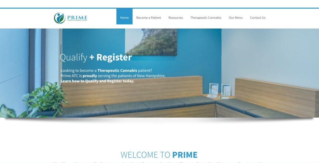
hasOptimization is proud to announce the launch of a new website for Prime Alternative Treatment Centers, also known as Prime ATC, a medicinal cannabis dispensary located in Merrimack, NH (and now Chichester, NH). Prime ATC needed some help dressing up their page so they could provide an easier menu of items to their customers, as well as providing necessary information to individuals so they can make the most informed decisions regarding their medication.
A case for custom post types
While integration with their menu was one aspect of the site build, one of the biggest aspects was organizing the areas where information for new and existing customers and prescribers would be placed. This meant creating custom areas and categories separate from the blog (where general news and announcements would be placed) that would visually look different, but would allow people to find what they need easily.
By utilizing WordPress’ custom post type abilities, we created a CPT for housing all of the resources, and created categories beneath it for patients, prescribers, product information, and more. When using these resources from the menu, the visitor is taken to an archive page which has the most recent posts in descending order, the categories listed on the right, and the most popular posts (which are likely to be the most helpful) also on the right. A search bar is always present in the navigation menu, which will allow visitors to search easily for information they are looking for. Additionally, when a visitor views a resource, they are also provided with other posts in the same category that may be of interest to them, easily interlinking the pages so customers can find what they need.
A modern look and feel
While Prime ATC’s old site was also a modern styling, Prime ATC’s team specifically requested some visual changes. They wanted to focus on a sort of minty green fresh feel in terms of the color scheme, interspersing some of the blue from their logo. They also wanted to use a “frosty glass” sort of look in some areas, which was easy to introduce into the footer and some other areas on the pages. We used gradients in the headers when images are not present, which gives a soft yet modern look and feel.

Of course, all of this comes with SEO upon launch, including new and updated meta tags, an open graph image for social media sharing purposes, and accessibility inclusion for titles and alt tags on images, allowing Prime ATC to put a best foot forward when they launch and let the site go into the wild.

We’re happy to help give Prime ATC the website they wanted and can’t wait to continue working with their team in the future. If you are in the market for a new website, contact us today with your specific wants and needs to get started!


