 Posted by Aimee Cozza on February 13th, 2023
Everyone wants to have a lean website. You know, the one that loads instantly and people never complain that it’s too slow or it takes forever to see what you want to see. One of the biggest factors towards having a lean website, especially for artists who are showing off a portfolio, is by having small (datawise) images. How can you accomplish that? By compressing your images, of course.
But when it comes to artists, image compression isn’t simply as cut and dry. If you’re a business offering a non-visual service (like cleaning, or plumbing), compressing your images isn’t a big deal, because it has no impact on your final product. For an artist, however, compressing your images on your portfolio site can drastically reduce quality, change your intended colors, or produce other unsavory results. As an artist, you’re trying to put your best foot forward with your portfolio, so compressing your images may seem like it will essentially countermand your efforts.
Still, your concern should be in finding the middle ground. That means having a relatively fast loading site, and providing as high of quality images are necessary for art directors that may be perusing your site to hire you for their next project. In this blog post we’ll go over some of the steps you can take to resize your images appropriately.
Step 1: Resize your images, max width and max height
The easiest way to shave megabytes and kilobytes off of your images is to resize them first. You don’t want to be providing full, high-resolution images to everyone on the web – never upload your high-resolution, final files to a front-facing area on your site! Instead, only provide what a person could possibly need at most. That means if you’re only using the thumbnail of an image, only upload a thumbnail-sized image. If the space is for a 150×150 px image, for example, only upload a 150×150 px image. Don’t upload a 1200×1200 px image and then have it sized down in the HTML to 150×150 px – that’s wasted data, and you’re forcing someone to download something much larger than necessary.
A good idea is to determine a max size (height or width) and use that universally. I used to scale all images to no larger than 1000 px at the longest dimensions, but, as the internet grew and larger screens became more common, I bumped that up to 1200 px at the longest dimensions. At absolute maximum, I am most likely to scale to 1500 px at the longest dimension. There is seldom a reason for a larger image in most cases. You could adopt this methodology for yourself.
Step 2: Use an image format that can be compressed
To get your images as small as possible without sacrificing quality, try a high-quality jpg rather than a png. Png format images usually always consume more data than a jpg. Pngs should likely be reserved for images that require the use of transparent pixels. You can shave off a lot of data just by converting from png to jpg. You will, of course, want to babysit these conversions as color changes and loss can occur. Make sure to do so through a trusted image editing program and not through a bulk conversion plugin or piece of software – there’s no telling what kind of outcome will happen if you’re not doing them all yourself.
You may also want to at least understand about WebP format images. WebP is a more recent image format made for low size, high quality images. You may notice WebP in use on many websites nowadays including Tumblr and Imgur, but you may not be ready to adopt it for yourself. The reason being that an AD or visitor may want to save artwork from your site, and WebP, since it is not compatible yet with every browser or program, can make it difficult to save and then later re-open those same images. Better to save the trouble if a visitor wants to save your art for later.
Step 3: Further compress your image
When saving in Photoshop, you have the most control over how an image saves. The dialog will prompt you over how much compression you want to use (1 being the most compression, and 11 being the highest quality image with no compression) and you can see in real time what the compression will do to your final image. This is a great first step, however, Photoshop is notorious for saving unnecessarily large files.
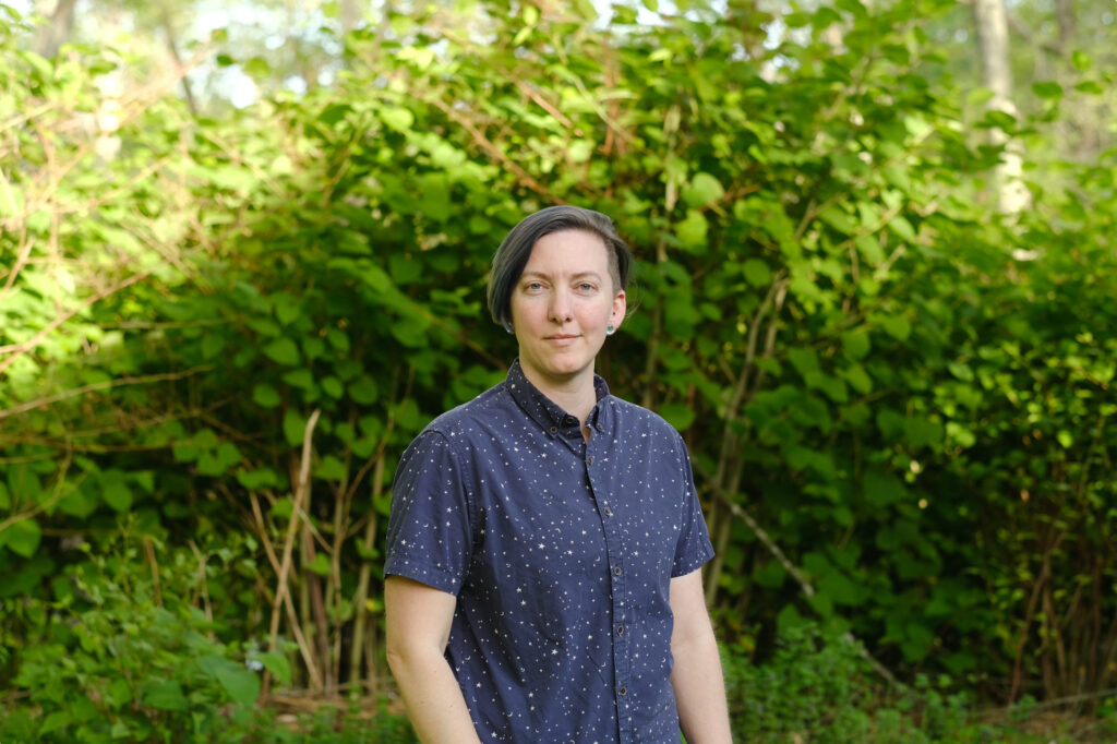
Even just opening a file in Apple’s Preview application, and then resaving it slightly less than “best” quality can reduce the amount of consumption of data your image has. For example, this image of Logan was 8.5 MB. However, reducing it in Preview to slightly less than best doesn’t show much noticeable difference, and brings the file size down to 4.7 MB.
From there, we can reduce even more. I like to use Squoosh.app for a majority of images. This allows me to both resize and change the compression level (plus compression algorithm) to get maximum savings. Using the photo of Logan above, I can run it through Squoosh’s default settings and save 85% – changing a 1.4 MB image to a 220 KB image.
Squoosh allows you to swipe between previews too, so you can see where colors are changing and data is being lost. Pay attention to crisp edges, as you are most likely to lose detail there. Slide the quality slider up and down until you get to where you want it, then click the download button.
It’s worth noting that Squoosh removes all metadata written to an image, so if you use that like I do to attach your artist information like your name, website, and email address, this may not be the best method for you, unless you plan to re-add that metadata after it’s been run through the Squoosh filter.
I hope this information helps you make better decisions regarding compressing your images on your art portfolio and website. Let us know if you have any specific questions by leaving them in the comments. We’re happy to answer any that we can!


This is a great article and very useful! Thanks for putting it out there 🙂