 Posted by Remy Housley on November 7th, 2022
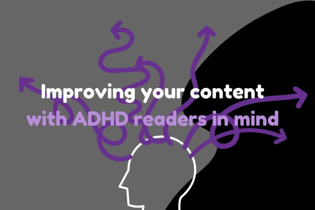
While ADHD is often represented by stereotypical children who can’t sit still, it is a lifelong condition that affects how people process information (among other things). This means that digital content—already often designed for a short attention span—can be a real struggle for people with ADHD.
The good news? ADHD-friendly content tends to be internet-friendly content. By making your content more accessible for people with ADHD, you are making it more successful as well. Here are seven tips to help make your digital content (blogs, ads, social media, etc.) more ADHD friendly!
#1 Be concise
Old-school SEO advice said you should repeat your keywords over and over again. However, the algorithms like the ones that form Google’s search engine have wised up to that approach, so it’s not nearly as effective as it used to be. Instead, think about the human people who are reading your text, and try to keep it short and sweet.
#2 Skimmability is key
Your ads and social posts are probably showing up while someone is scrolling through content. Even if they pause, you only have moments to convince them to stay. Bullet points are a great tool for skimmable content, but in addition, putting content in a logical order goes a long way.
#3 Make sure your action items are clear
Whether you want the visitor to sign up for a newsletter, share your post so that you have increased reach, or make a purchase, the quickest way to lose someone with ADHD is to distract them from your goal. If you want me to sign up for your email newsletter, it had better be easy to find, because otherwise, I’m going to get distracted and forget.
This is important in all things, but is especially vital for landing pages, because once you’ve paid for a click, you don’t want to do anything that will work against you!
#4 Ensure that your content is Dark Mode friendly

We ADHDers can be highly sensitive to things like light and sound. That means that a bright white phone screen may have us at a disadvantage before we even see your content. A lot of folks with ADHD love dark mode (cue me squinting like Gollum at every white background that pops up on my computer) as a way to reduce visual input.
Check how your content looks on devices that use dark mode to make sure that your content doesn’t get lost in the shadows!
#5 Use visuals to break up text…
See points 1 and 2 for an overview of how the wall o’ text isn’t our favorite thing. One way to mitigate this is by using graphics. Sometimes this might be a photo, and sometimes it might be a graphic (note: make sure if there is text on your graphic that it is included in the ALT!). However, don’t discount other visual elements: making text bold or italic, using headings, making text be different colors or have colored backgrounds are all other visual items you can use to help break up the wall o’ text.
#6 … but make sure your visuals are RELATED to your content
Remember that part about how ADHDers can be easily distracted? Visuals that are ONLY there to break up text and aren’t logically related to content can be very distracting. Try using a graphic that directly relates to the paragraph where it will be located. Remember back in school when the teacher would say “show, don’t tell?” You definitely want to both show and tell in this instance.
#7 At the same time, reduce visual clutter
It can be easy to hear advice like “use more visuals” and then go a little wild. At the end of the day, real humans will be looking at your content. Try to find a happy medium, where you are using images and graphics carefully and thoughtfully to help guide someone through your content.
With algorithms continually growing and learning in such a way that it can even discern the intent from your content, making good, quality content is key – even if all of your pieces aren’t going viral on social media. There’s no one-size-fits-all solution that ensures your content performs well every time. The same is true of people: ADHDers aren’t a monolith, so there’s no perfect way to make content ADHD friendly for everyone. However, these tips will help make your content clear and accessible for more people!
