 Posted by Aimee Cozza on May 26th, 2020
In 2019, you may recall if you’re a reader of the hasOptimization blog or you follow us on social media, we completed an overhaul of the Tentsmiths website. There are plenty of times where we’ve told customers, in no uncertain terms, that their website is holding them back. In the case of Tentsmiths, new owners Alena and Stephen were well aware of how the ancient, inadequate website for Tentsmiths was holding back additional orders from new customers who did not want to jump through hoops to complete a purchase.
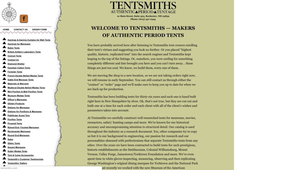

This can pose the question to many business owners: is your website holding you back?
But, the other side of the same coin is also those who choose to maintain an old, hard-to-navigate and use site simply for the fact that they are not equipped or even prepared for the amount of sales they may receive by upgrading their website. It can be hard to know for certain the amount of additional orders an already successful business may receive after removing roadblocks, and preparing for that eventuality can be not only daunting, but difficult.
Tale (Website) As Old As Time: Chessex
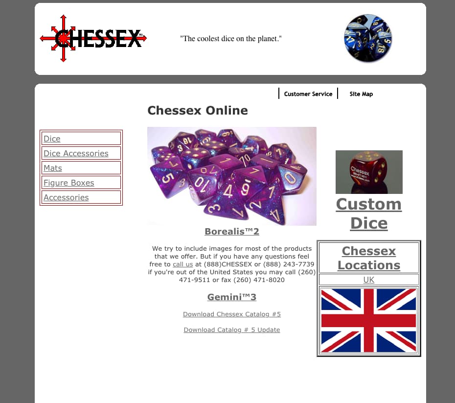
A funny thing about the internet is sometimes it acts as a time capsule. As long as web owners are up-to-date on their bills for domains and hosting, you can peruse the old websites of the days of yore, including dead, scarcely updated, or now spam bot overrun forums where ancient internet memes have been birthed. We can open up websites like this and remember what the web used to look like, being immediately transported back to the early 2000s or even the 90s after laying our eyes upon these ancient web standards. Many laugh at these old ghostly apparitions of the internet past, but others look upon them fondly — heck, Archive.org, or the “Wayback Machine” has years of these websites archived for visitors to peruse. There are still handfuls of businesses who have yet to hop on board to web 2.0, shirking fancy CSS and responsive web design for various reasons: no budget for a website, no time to sit down and have a website made, no workforce to support a website.
One such website and company, Chessex, has found a small bit of internet viral fame for their early 2000s nostalgia website with purposely convoluted directions for purchasing. Chessex, a producer of dice and die sets for popular board games as well as a distributor of popular tabletop board games, opened in 1987 and found success by becoming a wholesale distributor of products to both small mom-and-pop comic book and tabletop game stores and large retailers alike. Someone on Tumblr once suggested, “if you purchase any dice from a gaming store in the past 30 years, chances are they are Chessex brand dice.” Chessex has become synonymous with quality dice, great customer service, a great variety of dice… And a bad website.

To Chessex with All the Love in the World
In a Reddit thread titled “Can someone explain the Chessex website for me please?” an individual writes:
This probably the worst website I’ve ever seen in my entire life, holy [expletive]. I feel like I went back in time into the 90s.
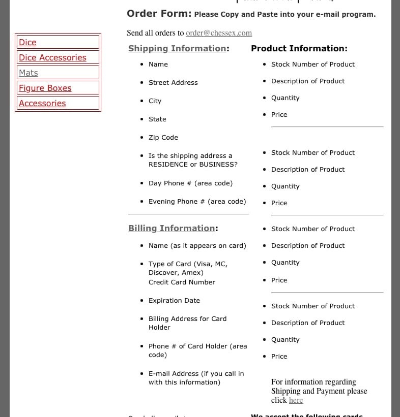
I have to send an e-mail order to buy something? There’s not even a shopping cart?
There’s just one 137*89 picture of the dice that can’t be enlarged, there’s no other angles or anything? There’s absolutely no information on how the dice are made or what materials they’re from.
And wtf is ‘26823 Gemini™ 12mm d6 Blue-Steel w/white Dice Block™ (36 dice)’ Am I ordering thirty six d6 dice?
What’s a ‘Dice Block™’ ???
How does this steaming pile of garbage earn any money? Don’t get me wrong, I like how the dice look, but I almost don’t want to buy any due to how awful, incoherent and confusing the website and the buying process are.

In a Tumblr post titled “to chessex with love” a user pontificates:
“it’ll never fail to amaze me that chessex, the game dice company – like if you bought your first dice set from a game store/comic shop/card shop you most certainly bought a chessex set – has such an ugly and poorly designed website. it looks like they went out of business 15 years ago.”
Lovingly, users of Tumblr hop on to laugh at the website.
![tiefling-queer
it’ll never fail to amaze me that chessex, the game dice company - like if you bought your first dice set from a game store/comic shop/card shop you most certainly bought a chessex set - has such an ugly and poorly designed website. it looks like they went out of business 15 years ago.
vornskr
i don’t know what’s better, the fact that they only sell five different things and felt like they needed a site map, the single uk location with the giant union jack, or simply the times new roman header which reads:
“The coolest dice on the planet.” ™
vornskr
THEY HAVEN’T UPDATED THEIR WEBSITE IN TEN YEARS????
vornskr
my mistake, literally every single page you click on has a different copyright date. so far I’ve seen 2001, 2005, 2007, 2008, 2009, 2011, and most recently 2012. amazing. well done chessex.
tiefling-queer
BUT LANA
HAVE YOU SEEN WHAT HAPPENS WHEN YOU TRY TO ORDER DICE?????
vornskr
you….you have to email them your order form. oh, gods. you…have to type your credit card information. into an email. so they can charge you seven dollars in shipping or 7% of the total order cost if it’s over $100. [expletive]. if you have questions about the cost of air shipping, you can fax them anytime. jesus christ. oh gods. [expletive]. [expletive] me up. chessex. the coolest dice on the planet. ™
zerofarad
this is another reason why I let my friendly local store make my chessex orders for me](https://www.hasoptimization.com/wp-content/uploads/2020/05/chessex-with-love.jpg)
“BUT LANA,” One user writes. “HAVE YOU SEEN WHAT HAPPENS WHEN YOU TRY TO ORDER DICE?????”
Indeed, ordering dice requires copy pasting a “form” into an email, along with a credit card number.
The True Story
While many people considered why Chessex would simply refrain from updating their website, we decided to send an email to Chessex themselves, and Lauren, a helpful support representative, was happy to answer our questions. We wanted to know what their general idea was about their website, what their thoughts were about it, and how they planned to continue with their website and content.
While a friend of the owner built the original Chessex back in we-don’t-know-when due to the inconsistent copyright in the footer from page to page, ultimately the arguably genius decision to keep the Chessex website unchanged was originally made by the Chessex owner Donald Reents. Reents fully intended to stunt the continually skyrocketing demand for tabletop dice by leaving each hurdle in place.
We asked what the company thought about the website, if it was a loving sort of joke at this point, or if they found it a thorn in their side. Many companies feel an attachment to their website, and others can sometimes stubbornly hang onto an old page for no other reason besides nostalgia.
“I would have to say that it is a bit of both [a joke and a thorn in our side].” Lauren answered. “There are jokes made about it but it is also a bit embarrassing and we do all want to get it up to date as soon as possible, as it would make our jobs much easier and be an improvement to business.”
It’s not hard to understand why an improved website experience can help improve business for both the customer and the staff working at that business. Fielding questions about where something is and why it’s not listed properly on a website can be challenging, on top of repetitive and annoying. Answering customer’s questions with information presented on a website before they shoot over to your contact form or support email can help keep staff from feeling overwhelmed. Removing obstacles for customers also removes obstacles for staff, allowing for a more streamlined business overall.
But the question still remains — is purposely creating hurdles for customers an adequate way to stymie the funnel of orders, or does it alienate more customers than it should? Do those customers forever leave your product with a bad taste in their mouth to never return?
The Future of Chessex
When we sent out our initial email asking about Chessex’s website, we assumed that they had many people offer to make them a website, and they were still focused on keeping the out-of-date website up despite constant poking and prodding to update it. We asked if there were any plans to update in the future, or if the website was going to remain as-is for the rest of eternity.
“We are actually in the process of updating our website! We have one up and ready to go but are testing it and fixing any errors that we might find.” Lauren explained in a return email. “The pandemic has slowed this process some. We are also trying to take all the pictures for all sets and loose dice product that we have available. However, the general reason that the website has not been updated up until this time is because we were worried about not being able to handle the sales. At the time I started, we were having a hard time keeping product on the shelves without a modern website and the demand had been skyrocketing.”
We were both surprised and thrilled to hear Chessex is working on a new website! We’re certain the rest of the web will be thrilled to hear it, too. Time will tell how an updated website will impact Chessex’s bottom line. If we were to forecast, we would imagine it would help free up staff from repetitive emails and answer questions on site, without customers having to end up on Reddit for help. What this generally means for a business is an upward trend in sales. How much, though, remains to be seen. If the sales performance we saw following the launch of the new Tentsmiths website last year proves to be any sort of indication for Chessex’s success, they can expect an increase in orders from new customers rather than those that are used to the “hoops” of the old website.
We can’t wait to see the new Chessex website, and we’re eager to see how the internet reacts to it as well. We’ll be sure to share with you the updated Chessex website when it rolls out! Until then, if you want to step into an internet time machine and bring a small smile to your face, check out Chessex’s website now.




the update is finished if it was a 1/10 before it is maybe a 2/10 you should do a follow up article
Wow you really WERE NOT joking. The SSL certificate error right off the bat is the cherry on top!