 Posted by Aimee Cozza on June 5th, 2016
hasOptimization is proud to announce the launch of another new site. Progressive Spine & Rehab is a Manchester based chiropractic office that offers massage therapy, physical therapy, chiropractic therapy, and more.
Progressive Spine had recently undergone an owner change. Originally known as Merrick Spine Center and owned by Dr. John Merrick, the company became Progressive Spine and Rehab under new owner Dr. Eric O’Connell. Since the old website was reflective of the old name, Dr. O’Connell needed a new website to show the change in ownership as well as improve SEO and usability. hasOptimization drafted up a few template ideas for Progressive Spine, and once Dr. O’Connell chose, it was easy to create a new, reactive website to fit his needs.
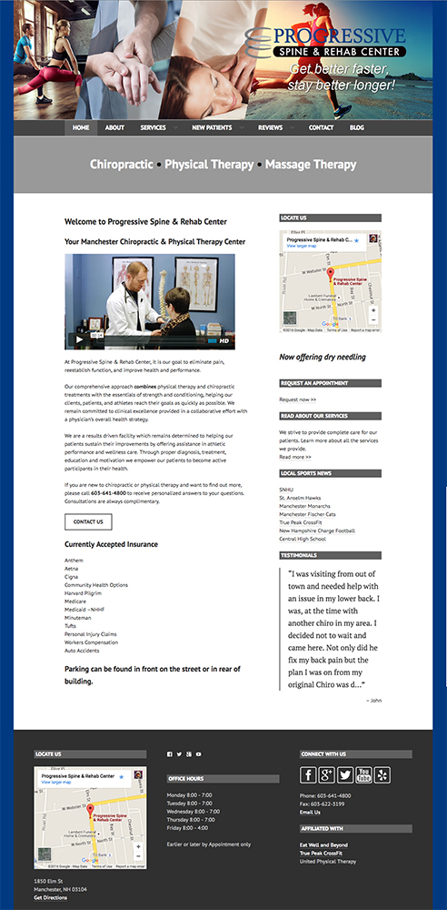
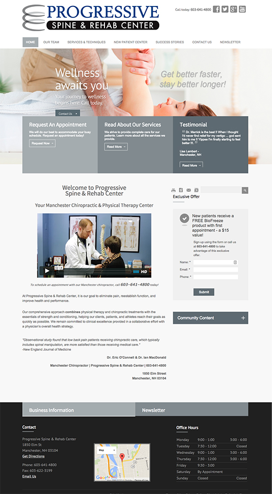
Building a new website on WordPress allowed Progressive Spine to have a slew of new features. The old website was developed on a chiropractic specific website builder. While this was useful for a quick and easy website, and also provided a lot of chiropractic specific content, it came with a lot of downfalls. The first was that the developers of the site builder had complete control over the website content. This means that the owner of the site could not change a lot of things, such as the template of the site, side bar items, or headers. The next biggest downfall was that the templates were very “cookie cutter”, meaning other chiropractic offices could use the same template, same colors, and same images on their own websites. With the new WordPress install, we wanted to differentiate Progressive Spine from everyone else with a custom header, custom design changes, and custom colors, while using a pre-made template to keep the budget small. While others may have the same basic theme, the details here are all Progressive Spine & Rehab’s.
In addition to the changes for the theme, upgrading to WordPress meant more flexibility for SEO. On the old site, we were forced to define a single title and description, as well as keywords for the entire site. This meant that every page of the site ran the risk of being indexed as duplicates. It also meant that we were losing the ability to test and use valuable keywords that may have pertained only to certain sections of the site. With the new site, all of these concerns were alleviated.
Before:

As an added bonus, the new website was built with a responsive theme that makes viewing on mobile easy and beautiful. The old website builder did not have that, which makes this website a huge upgrade.
You can check out the new website by clicking through here or by clicking the image below. While the superficial, appearance-related changes may seem minor, it is under the hood that this new site really shines–and the post-launch performance of the new site reflects that.
After:
Interested in a refreshed website for your business? Get in touch!


