Welcome to the slightly-delayed (thanks, holidays) fourth installment of my Organizing Your Blog series. Previously, we covered why you should organize your blog, how to set yourself up for success, and best practices for categories and tags.
Today, we’re covering elements that improve the user experience on your site, keeping your readers around for longer and making them happier.
Blog Organizational Elements to Improve User Experience
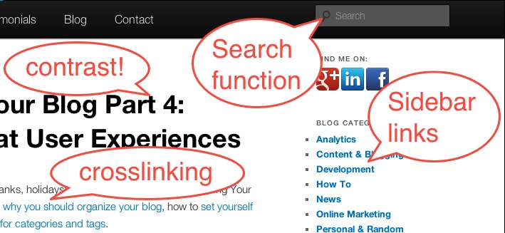
- Sidebar links: Now that you have good structures in place, make them work for you and your readers! Putting the tag cloud, category list or date archives in a sidebarthat appears on your blog is a great way to encourage browsing of your content. A recent posts or recent comments (if you get lots of comments) list can also be good. This makes your blog easier to browse and more useful, as well as helping to keep readers on the site.
- Cross-linking: Another option for creating a good user experience and keeping people on site longer is cross-linking your posts. For an example, see the first paragraph of THIS post! Linking posts to each other makes it easy for readers to find related content, which they like, and keeps the reader on your website for longer, which YOU like.
- Search Box: WordPress has a search box built into it. USE IT! Give your readers the option of searching to find content. It’s the nice thing to do, and again it may keep people on the site for longer.
- Readability: Readability is an under-valued factor. People simply do not pay attention to whether their content is readable for all their readers! This could be a post of its own, but here’s a few key points: Use a font that contrasts with your background, make your font large enough for your readership (older folks may not be able to read 10pt), space your paragraphs, and keep your blind or vision-impaired readers happy by using alt text on your images (also good SEO practice) and making sure your site can handle screen-reading systems (WordPress’ default templates do this well). Another key point: PROOFREAD!
- General site layout: Don’t overdo it on advertisements, especially moving/blinking ones. Don’t use auto-play on videos or music (I know, I know…but users universally hate it). Preview your posts to ensure that the formatting looks and functions well.
While good SEO, social media or advertising can get people TO your site, it’s the user experience that will keep them there–and keep them coming back. Don’t under-value this crucial element! Have a few friends or a trusted consultant review your site and give comments–you may find issues that would never have occurred to you.
What blog organization topics or questions do YOU want to see covered here? Let me know here or in the comments.
